supplier_dc_rest <- read_xlsx("output_files/supplier_dc_restaurant.xlsx")ggplot(supplier_dc_rest, aes(x = Day)) +
geom_line(aes(y = overall_rest_received, color = Product_Category), size = 1) +
geom_line(aes(y = overall_rest_sold, color = Product_Category), linetype = "dashed", size = 1) +
labs(title = "Received vs Sold Volume by Product Category", x = "Day", y = "Volume") +
theme_minimal()Warning: Using `size` aesthetic for lines was deprecated in ggplot2 3.4.0.
ℹ Please use `linewidth` instead.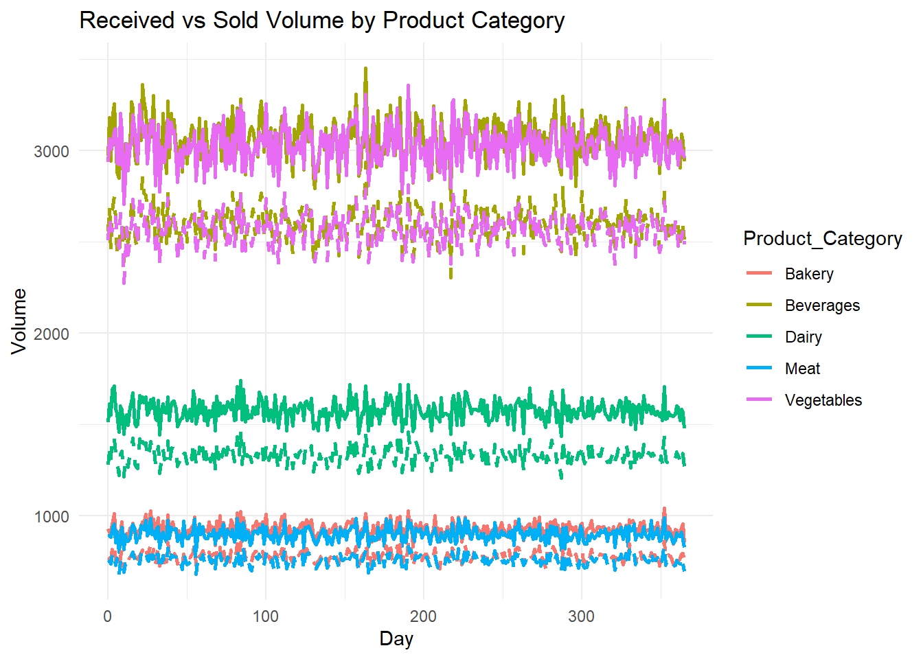
ggplot(supplier_dc_rest, aes(x = Product_Category, y = (overall_rest_received - overall_rest_sold), fill = Product_Category)) +
  geom_bar(stat = "identity") +
  labs(title = "Waste by Product Category", x = "Product Category", y = "Waste Volume") +
  theme_minimal()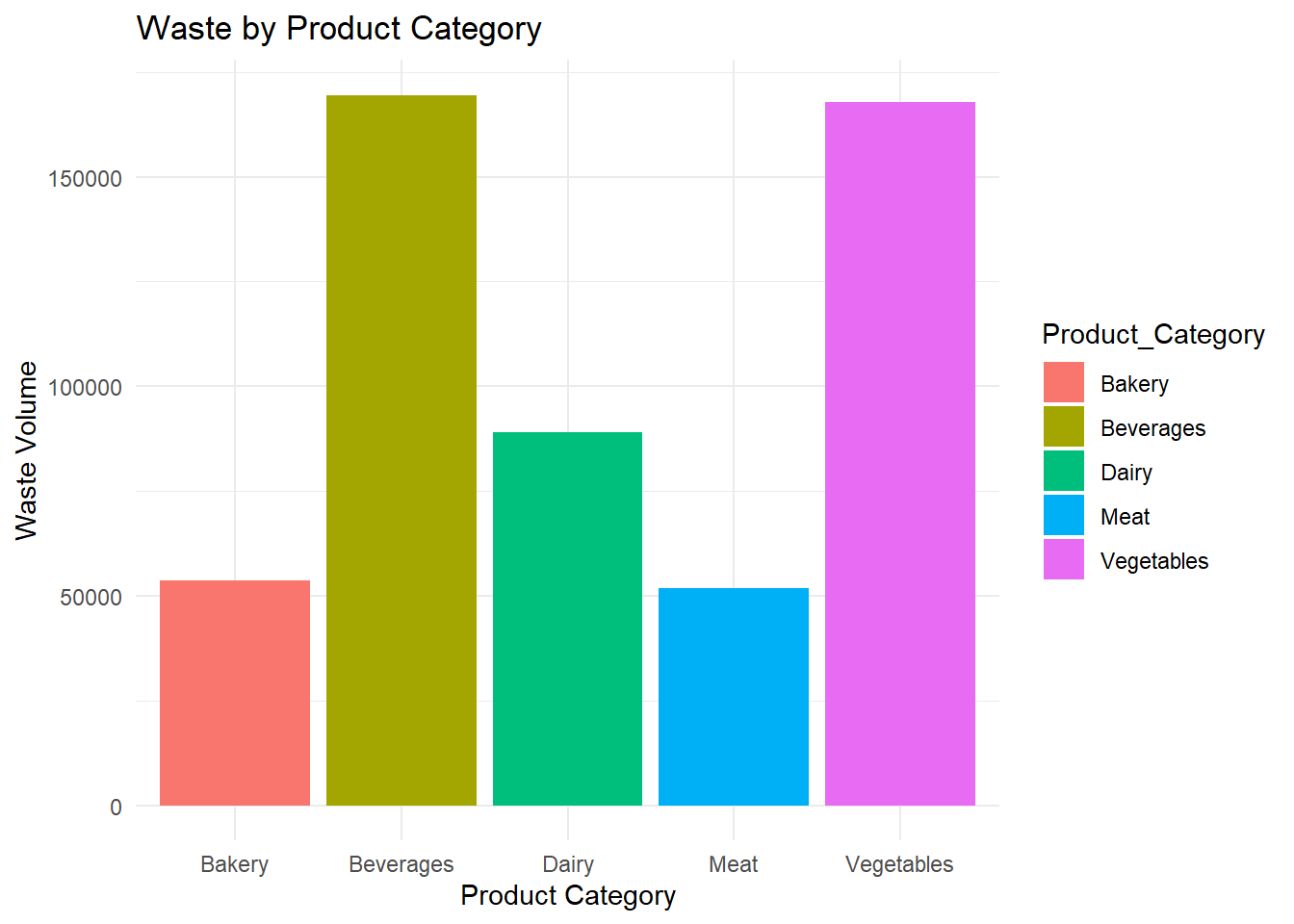
ggplot(supplier_dc_rest, aes(x = Product_Category)) +
  geom_bar(aes(y = overall_supplier_produced, fill = "Supplier Produced"), stat = "identity", position = "dodge") +
  geom_bar(aes(y = overall_dc_received, fill = "DC Received"), stat = "identity", position = "dodge") +
  labs(title = "Supplier Production vs Distribution Center Receipts", x = "Product Category", y = "Volume") +
  scale_fill_manual(values = c("Supplier Produced" = "skyblue", "DC Received" = "orange")) +
  theme_minimal()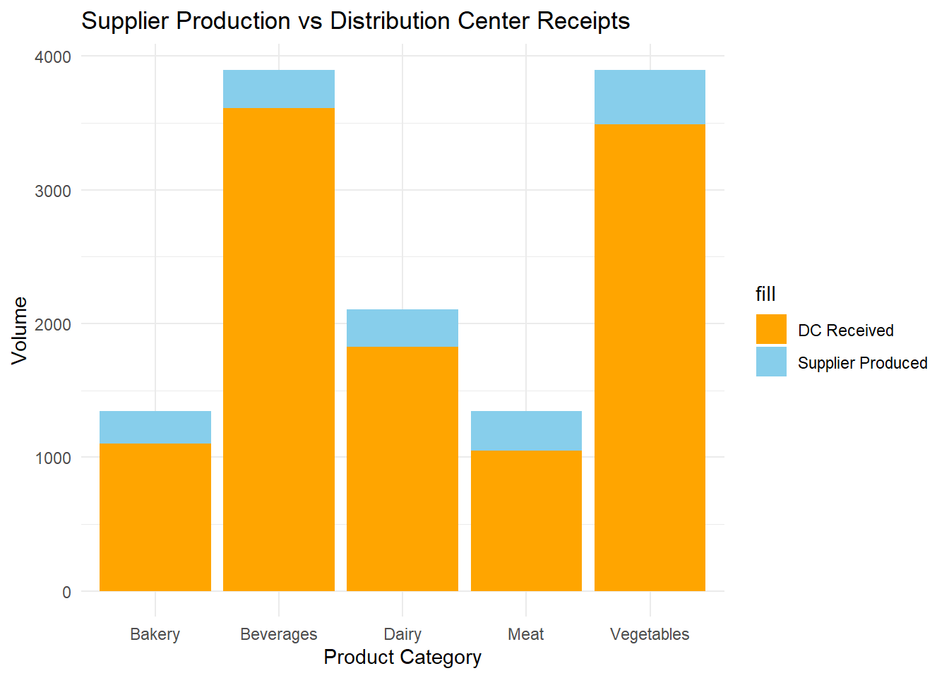
library(tidyr)
library(ggplot2)

# Reshaping the data to long format for heatmap visualization
heatmap_data <- supplier_dc_rest %>%
  pivot_longer(cols = c("overall_supplier_produced", "overall_dc_received"),
               names_to = "Stage", values_to = "Volume")

ggplot(heatmap_data, aes(x = Product_Category, y = Stage, fill = Volume)) +
  geom_tile() +
  scale_fill_gradient(low = "white", high = "blue") +
  labs(title = "Supplier Production vs Distribution Center Receipts Heatmap",
       x = "Product Category", y = "Stage") +
  theme_minimal() +
  theme(axis.text.x = element_text(angle = 45, hjust = 1))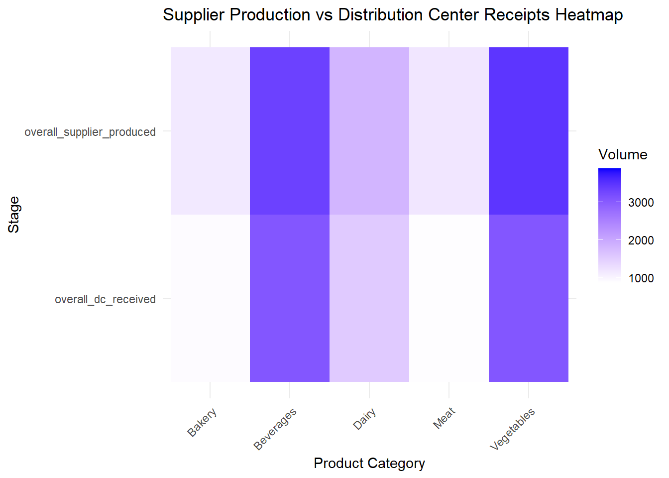
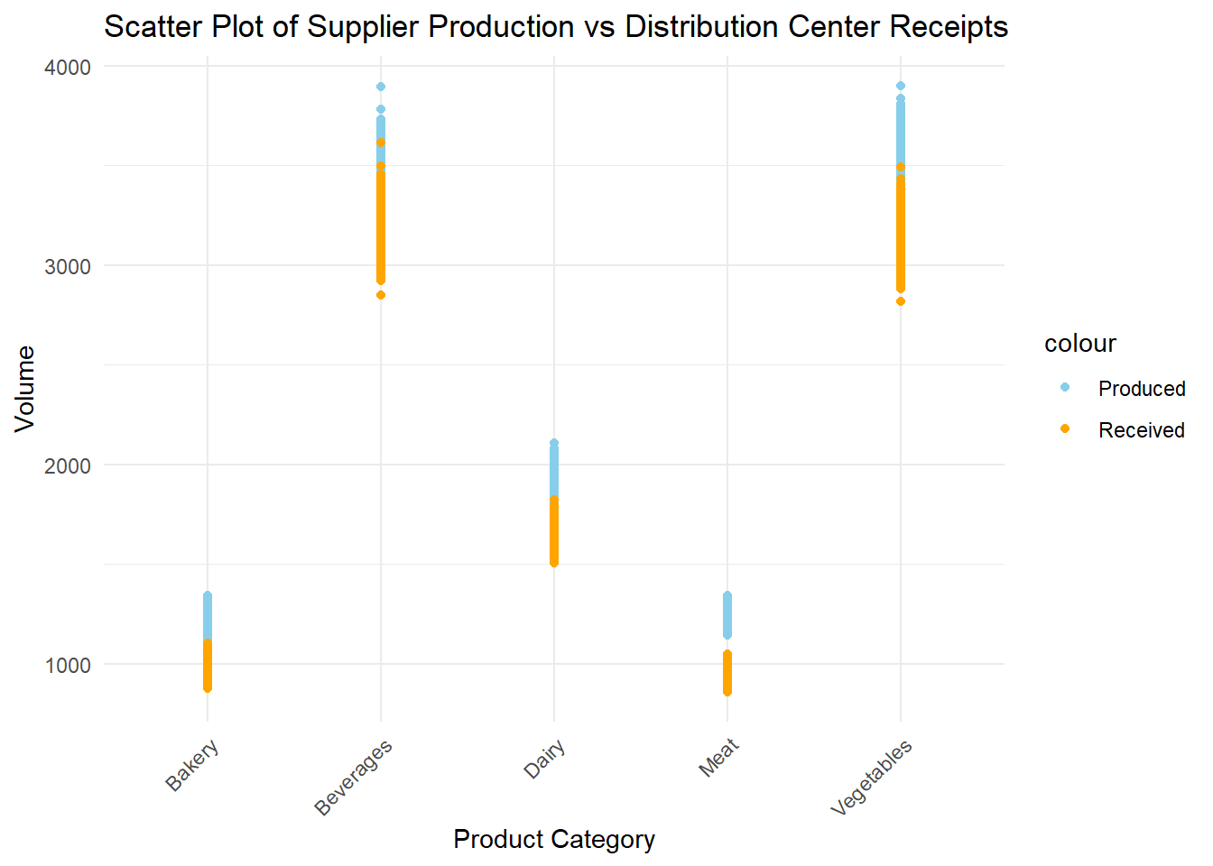
ggplot(supplier_dc_rest) +
  geom_point(aes(x = Product_Category, y = overall_supplier_produced, color = "Produced")) +
  geom_point(aes(x = Product_Category, y = overall_dc_received, color = "Received")) +
  labs(title = "Scatter Plot of Supplier Production vs Distribution Center Receipts",
       x = "Product Category", y = "Volume") +
  scale_color_manual(values = c("Produced" = "skyblue", "Received" = "orange")) +
  theme_minimal() +
  theme(axis.text.x = element_text(angle = 45, hjust = 1))